by Peter Jones
Everyone knows the Tidyman – he’s one of the most printed images in history, having appeared on all kinds of packaging all around the world for over half a century.
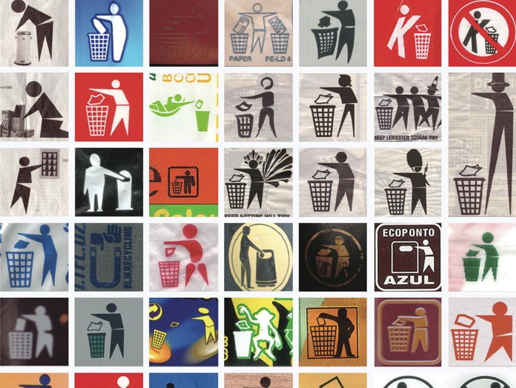
His appearance may have varied from time to time – his many manifestations include footballer, samurai, lion, penguin, hog and the letter ‘K’ – but these variations all trade on people’s familiarity with the archetypal figure – man, bin and waste working in harmony; an idealised ‘com-bin-ation’, as it were. He even has a website dedicated to celebrating his history and diversity. Yet despite his pervasiveness and widespread recognition, the Tidyman logo’s origins are surprisingly mysterious.
It’s clear that he’s a child of the post-war consumer boom, which swept America in the fifties and rapidly spread across the West. Indeed, one can hardly imagine that, prior to 1950, the Tidyman would have been needed. If you look at 16th and 17th century archaeological sites, for example, the ubiquity of clay tobacco pipe stems is not due just to inveterate smoking amongst our forebears, but also to pipes being amongst the few common items that couldn’t be repaired, weren’t biodegradable, and had no material value. As a result they seem to have been littered extensively – the precursor of today’s cigarette butt problem.
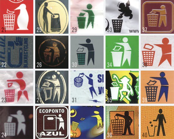
Some of the many faces of the Tidyman. Image courtesy of Tim Smith (My Poor Brain).
Archaeo-logo
Through the 18th and 19th centuries, life and labour by and large remained cheap enough in comparison with commodities that it was worth someone’s while to pick up practically anything that was abandoned in the street. The various volumes of Henry Mayhew’s London Labour and the London Poor include an exhaustive taxonomy of the people who scraped their living from the city’s detritus in the 1840s – distinguishing the various types of “street finders or collectors” – the mud-larks who combed the banks of the Thames for anything of value, the bone grubbers, the cigar-end finders, the “pure” finders (who kept Bermondsey’s tanneries supplied with dog droppings), and a good number of general purpose “scavengers” working in organised groups. With the labour of all these benighted souls, not much in the way of litter can have remained.
By the 1950s, however, labour had increased in value, while mass production was making products cheap, making the concept of a throw-away society, in which an increasing range of discarded items simply weren’t worth the effort to pick up, thinkable. At the same time, the rise in car ownership and the expanding road network meant more people taking their stuff out of town – and ditching it on little-frequented roadsides and open land, where even those still motivated to “scavenge” would be unlikely to happen across it.
Chrono-logo
In fact, it’s remarkable how quickly the need for the Tidyman seems have been realised as a response to this rapid societal change. Some have attributed the logo to the Budweiser beer company, suggesting that it might date from as early as the 1950s. However, having been in touch with Anheuser-Busch, today’s producers of “the king of beers”, they have no record of Budweiser using the Tidyman prior to the 1970s.
Others have traced the design to a collaboration between Keep America Beautiful (KAB) and the “American Brewers Association”, originating sometime in the 1960s. Unfortunately, KAB seems to have rather more affection for Iron Eyes Cody, star of their famous “crying Indian” anti-pollution advert than for the humble Tidyman and couldn’t enlighten me as to his origins. Indeed, I found no trace of him on their website.
Meanwhile, the Beer Institute (successor to the US Brewers Association (USBA) – there’s no record of an ‘American Brewers Association’) was unable to dig up anything about the Tidyman from their archive. It took a call to Keep Britain Tidy (KBT), who brought the Tidyman to UK bins and packaging at the end of the 1960s and hold its UK copyright, to get hold of more details. Their records state that it was indeed the KAB and USBA who worked together to devise the Tidyman, with Budweiser supplying the funding – but nothing in their annals could shed light on who negotiated his transatlantic transfer or how his popularisation in the UK came about.
Futuro-logo
So, whilst he remains as widespread as ever, the Tidyman’s origins appear to be lost in the mist of time. Even after contacting all of the organisations credited with devising and disseminating him, I’m no closer to finding out who designed him, or how that particular image was selected – nor even how he made his way from the drawing board to take his place on our packaging. If any reader can supply more details, I’d be delighted to hear from them.
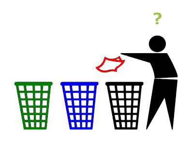
The twenty-first century Tidyman’s dilemma. Image: trad arr. Peter Jones
If his past is uncertain, what of his future? In the UK, the Tidyman underwent something of a controversial facelift in 2010, gaining a heart (and a torso more securely fastened to his legs) as he took his place in KBT’s “love where you live” campaign. However, despite being updated, he faces a still more serious challenge.
Increasingly, but far from uniformly, recycling bins are on the rise in public spaces, and the simple message “put it in the bin” seems to be becoming less adequate. Nowadays, the would-be waste disposer needs to understand which bin is appropriate for their waste – a far from straightforward issue when bin colours and the range of recyclable materials vary from place to place, and the On Pack Recycling Logo has begun to usurp the Tidyman’s place on our packaging.
However, the Tidyman’s work is far from done, with litter remaining high on the agenda as Defra embarks on the development of a new anti-litter strategy for England. In many of our less populous areas, it is unlikely that we will ever see recycling containers sitting alongside each litter bin, and the focus will remain on making sure that waste isn’t discarded on the ground. And if the Tidyman’s message is understood as “dispose of this carefully and thoughtfully”, then he will continue to merit a place on our wrappers, packets and bottles for many decades to come.


Leave A Comment